


Keyword Planner Case Study
Solution Design for SAAS Digital Product
The Team
1 UX Designer (Me)
1 UX Researcher
1 UX Writer
1 Product Manager
3 Engineers
Company
Google
Contract Duration
1 year
My Role
Connected with cross-functional team members and UXR
to determine the most prominent user education pain pointsDesigned Solutions to alleviate these pain points
Collaborated with UX writer to articulate complex in
tool education
Background
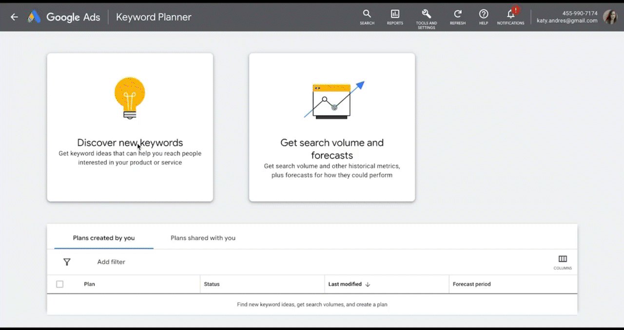
What is a Keyword Planner? A Google Ads tool that helps you generate and forecast the best keywords to maximize your ad campaign.
The Problem
Keyword Planner has been around for nearly a decade and has over 700K users monthly. But with all the recent UI changes even seasoned users have some confusion over fully grasping the complexities of the tool.
Say I want my product ad to run on relevant searches...

Keyword Planner helps me find effective keywords for my campaign
UX Research
User Feedback
According to research conducted by the UXR department, users were struggling to understand the depth of all Keyword Planner is capable of. Existing in tool help was not clear.

Finding the Pain Points
In collaboration with UXR and the technical support departments, we identified 6 main pain points based off customer satisfaction and technical support reports.

For the purpose of this case study we'll only be focusing on Pain Point #1 which makes up 36% of annual technical support tickets.

Objective
Our main objective is to make Keyword Planner more approachable providing various aids at known pain points to broaden understanding. To do this, we’ll need to define the principles for which we’ll aim to design around.

UI must be “user aware”. Content should not appear spammy, generic or noisy. Remobe or reconsider if so.

Provide enough granularity w/o provoking user confusion. Build content & context within tool if possible.

Solutions should be easy to implement and upkeep across ongoing feature rollouts.
Let’s take a closer look at our 1st pain point CUJ (critical user journey):
Keyword Eligibility
Question
Why were “All keywords removed?”
Answer
Because all keywords related to children are flagged as “sensitive”
An Expensive Problem
Because keyword eligibility accounts for 36% of help tickets annually, time and money are being wasted to resolve thousands redundant occurrences.
The Challenge
Because users with ill intent have tried to explore Keyword Planner, the tool over flags sensitive keywords
Until now, the team has chosen to keep the error message language vague but it’s leaving honest users incredibly confused
Copy related solutions call for collaboration with a UX writer
Updating this text required approval from Google’s Public Relations team
Working With a UX Writer
In a working doc, the UX writer and I tracked all original and proposed text. My rough passes were reviewed and re-written by the UX writer. Scheduled check-ins to review and collaborate
Action Steps to the Solution
Clarify why the user’s keyword(s) did not work
Provide insight as to what else might work
Place the resources easily within reach when the error message is received


Final Solution
After many iterations and cross-functional reviews, our final solution successfully clarified the user’s confusion over keyword eligibility, resulting in an estimated 45% decrease in annual help tickets generated for this pain point and an estimated $100,000 saved for help desk resources.